
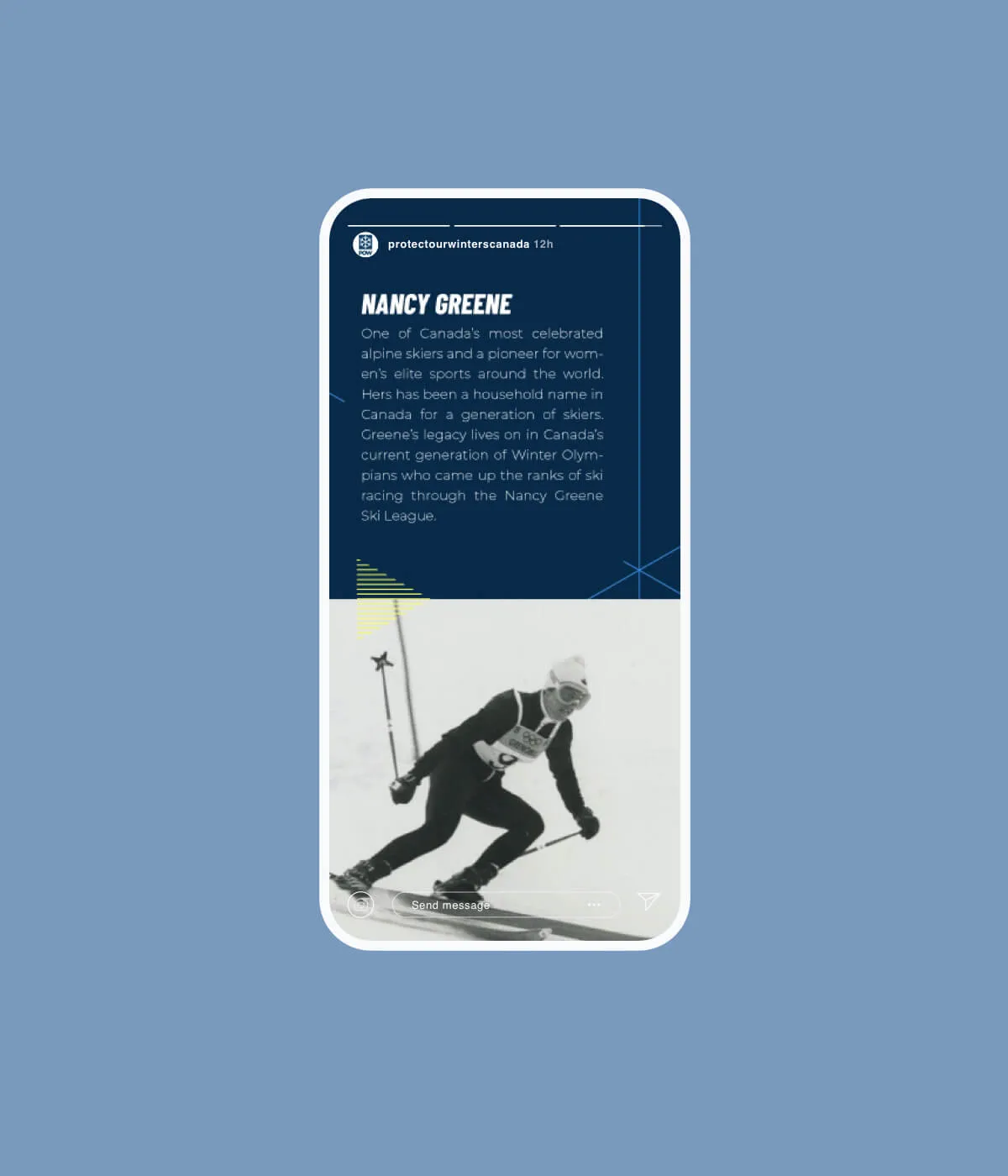
A fresh new look for POW Canada
As a founding partner of Protect our Winters Canada, we’ve witnessed the brand challenges inherent to a small team with a big vision. We saw an opportunity to update the brand visual language to increase consistency and establish some rules in an effort to maintain brand cohesion as the organization grows and multiple chapters throughout the country are creating content. We provided a visual platform to inform content creation across multiple channels and initiatives while remaining rooted in a brand that unmistakably feels like POW.
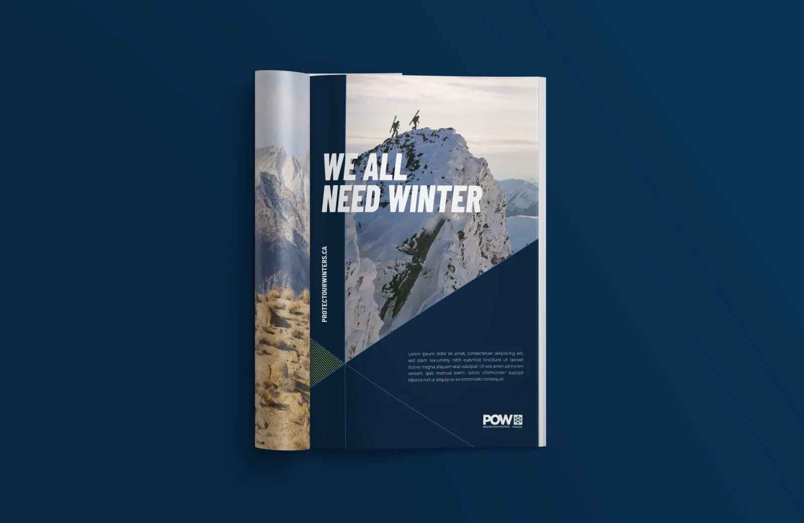

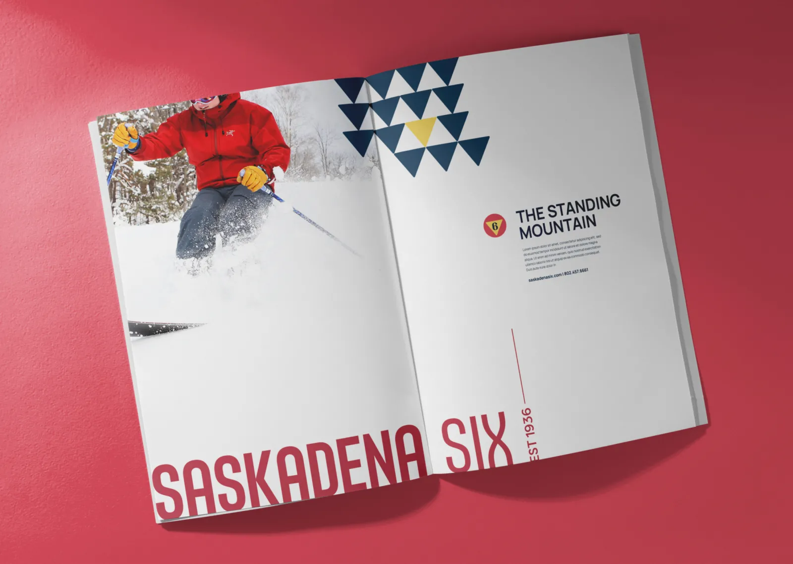
The Convergence
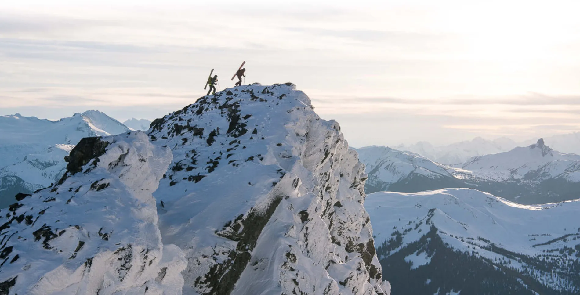
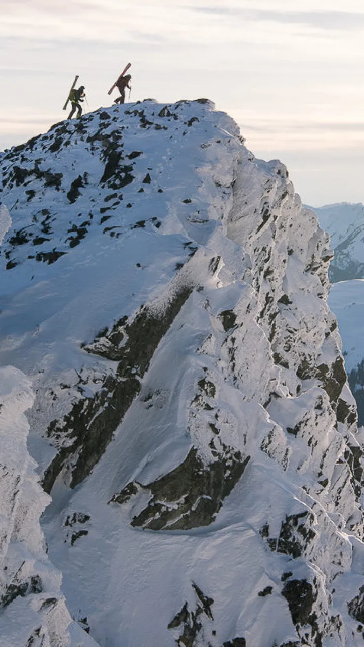
We created a minimalist grid system of converging lines, inspired by POW’s snowflake iconography. These lines represent the forward momentum toward change, which reinforces the core DNA of the POW brand.
From athletes to activists, educators to change-makers, POW is the catalyst for these changes and the connector of these groups. Together, they become the driving force behind our fight against climate change.
Create space
The Convergence Grid gives designers a versatile system to create impactful layouts with spaces to feature the most important content and messages. And while we haven’t done the math, we’re confident that the possibilities are almost endless.
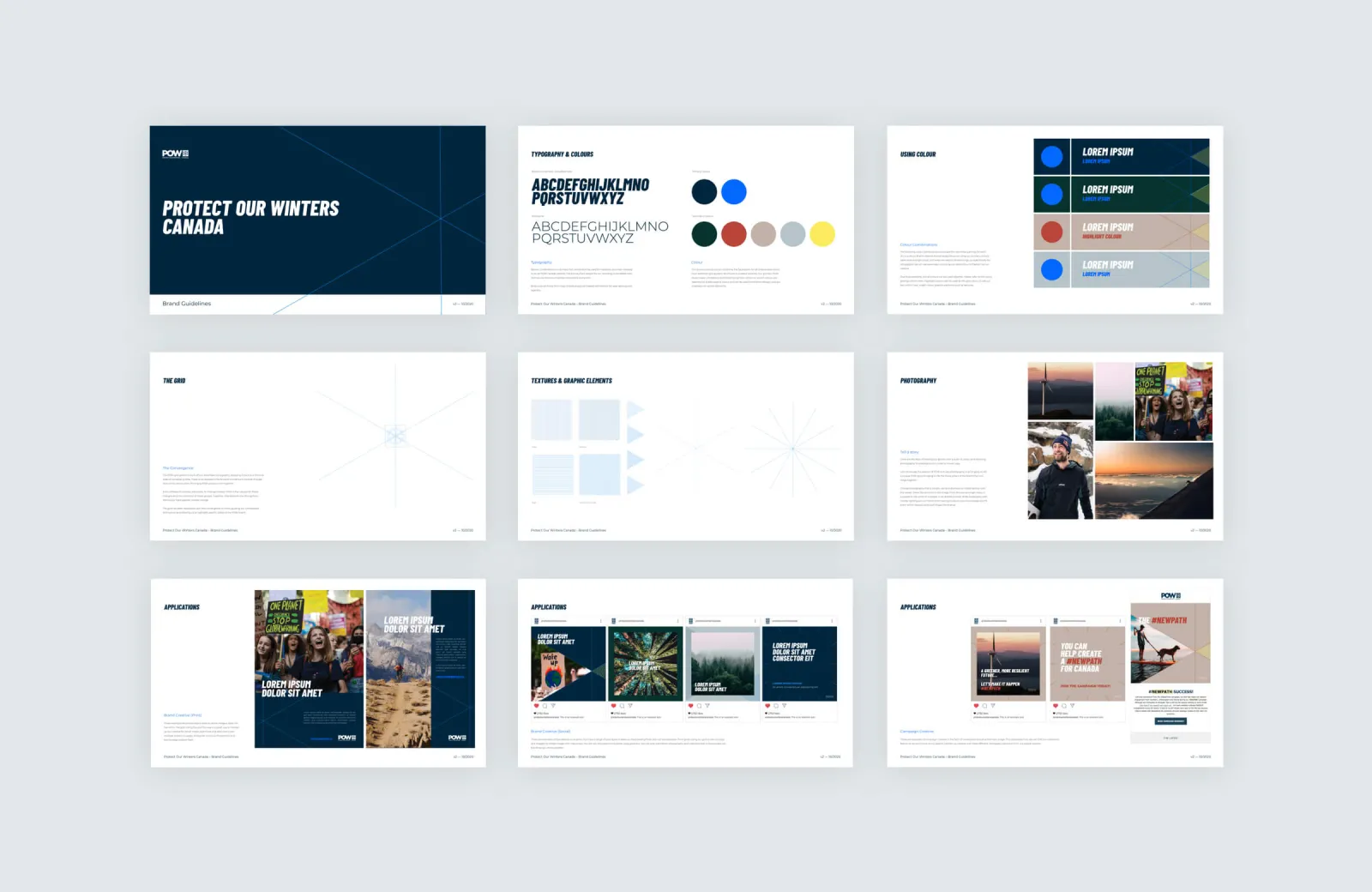
Colour
Primary brand blues are the foundation for all creative executions from advertising to apparel, brochures to outdoor banners. The primary palette creates consistency and brand recognition while our accent colours are reserved for subtle pops of colour and can be used to enhance designs and put emphasis on certain elements.
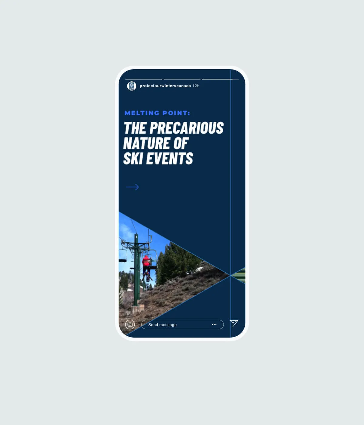
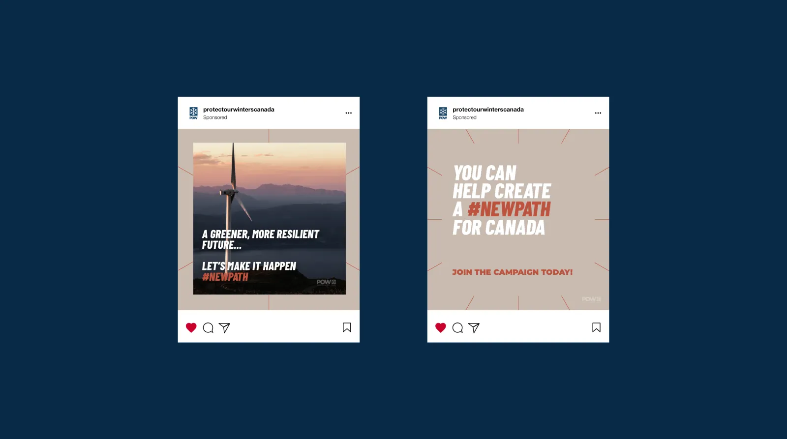
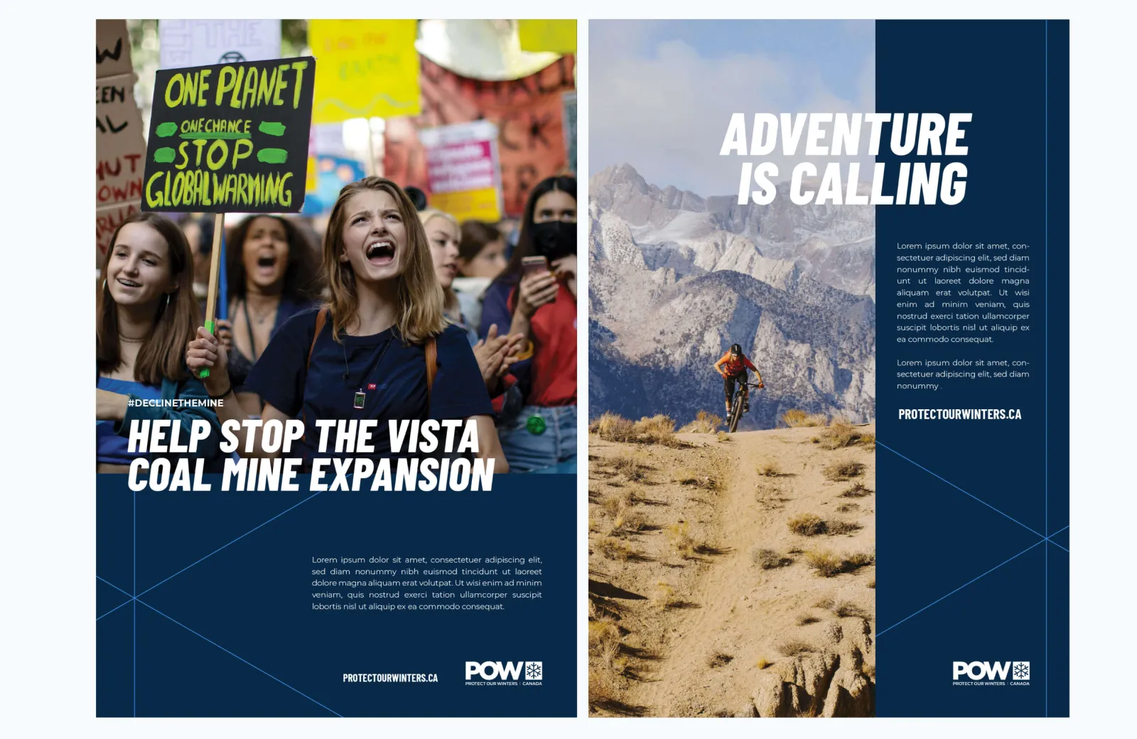
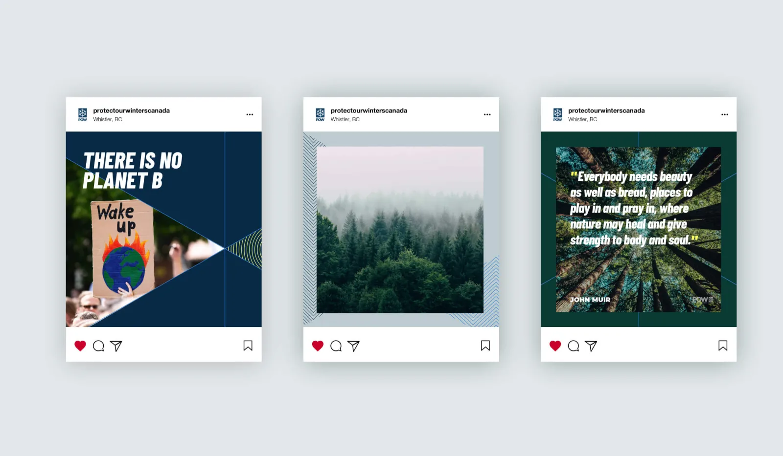
Campaign creative
When creating content under specific advertising campaigns or initiatives, the secondary colour palette brings a fresh look to help differentiate specific messaging and communications.
More related Branding + Identity Work
From partner to presence: a new kind of national parks brand