From partner to presence: a new kind of national parks brand
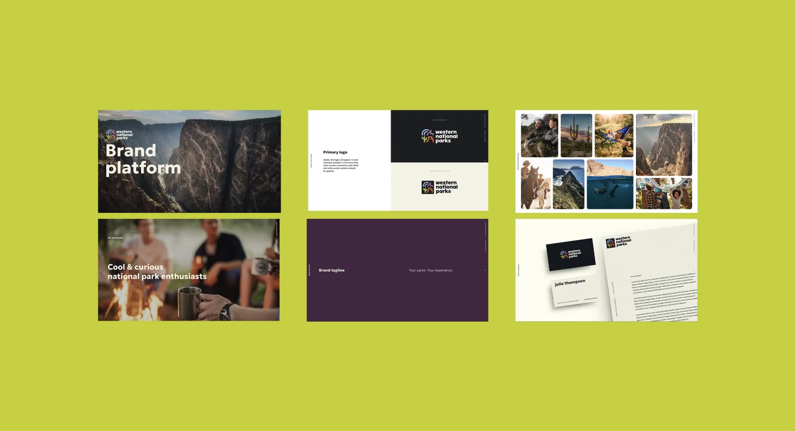
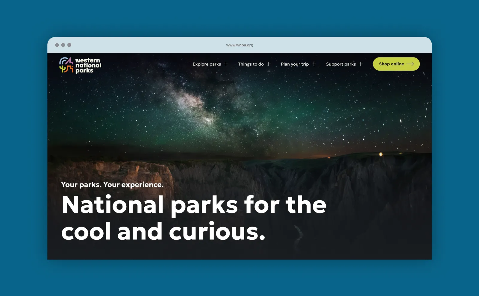
Western National Parks Association is evolving from a long-standing philanthropic partner of the National Park Service into a forward-thinking, consumer-facing brand that enhances and amplifies the national park experience. This shift is expressed through a refined brand platform and a newly redesigned website (wnpa.org), both built to connect people to parks in deeper, more meaningful ways. Grounded in clarity, inclusivity, and warmth, the design celebrates not just the parks themselves, but the people who find inspiration in them.
Inspiring, Accessible, and Warm
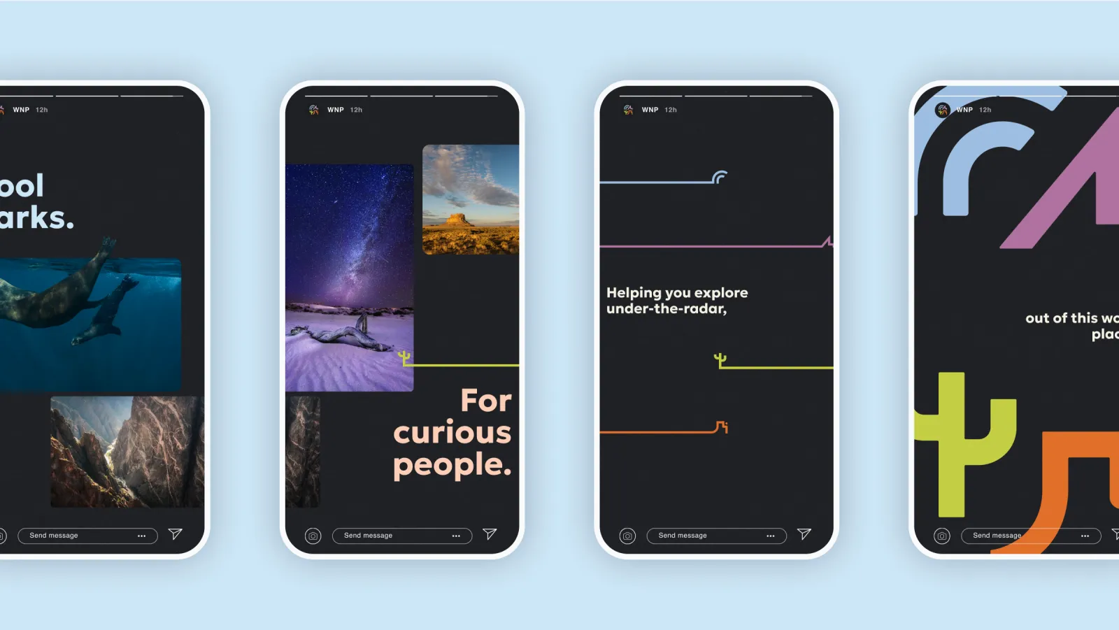
At the heart of WNP’s reimagined brand is a voice that invites everyone in. The tone of voice is intentionally inclusive, never preachy or overly casual. Instead, it aims to empower people to discover and enjoy national parks, regardless of background or experience. It’s light-hearted without being silly, informative without sounding superior, and passionate without being overbearing. This approach is evident throughout the website, where trip planning tools, product descriptions, and educational content feel like they were written by a trusted friend—someone who knows the terrain but still remembers what it’s like to be new to it. The result is messaging that feels both expert and empathetic, always rooted in WNP’s core belief: that national parks belong to everyone
Rich in Symbolism, Grounded in Purpose
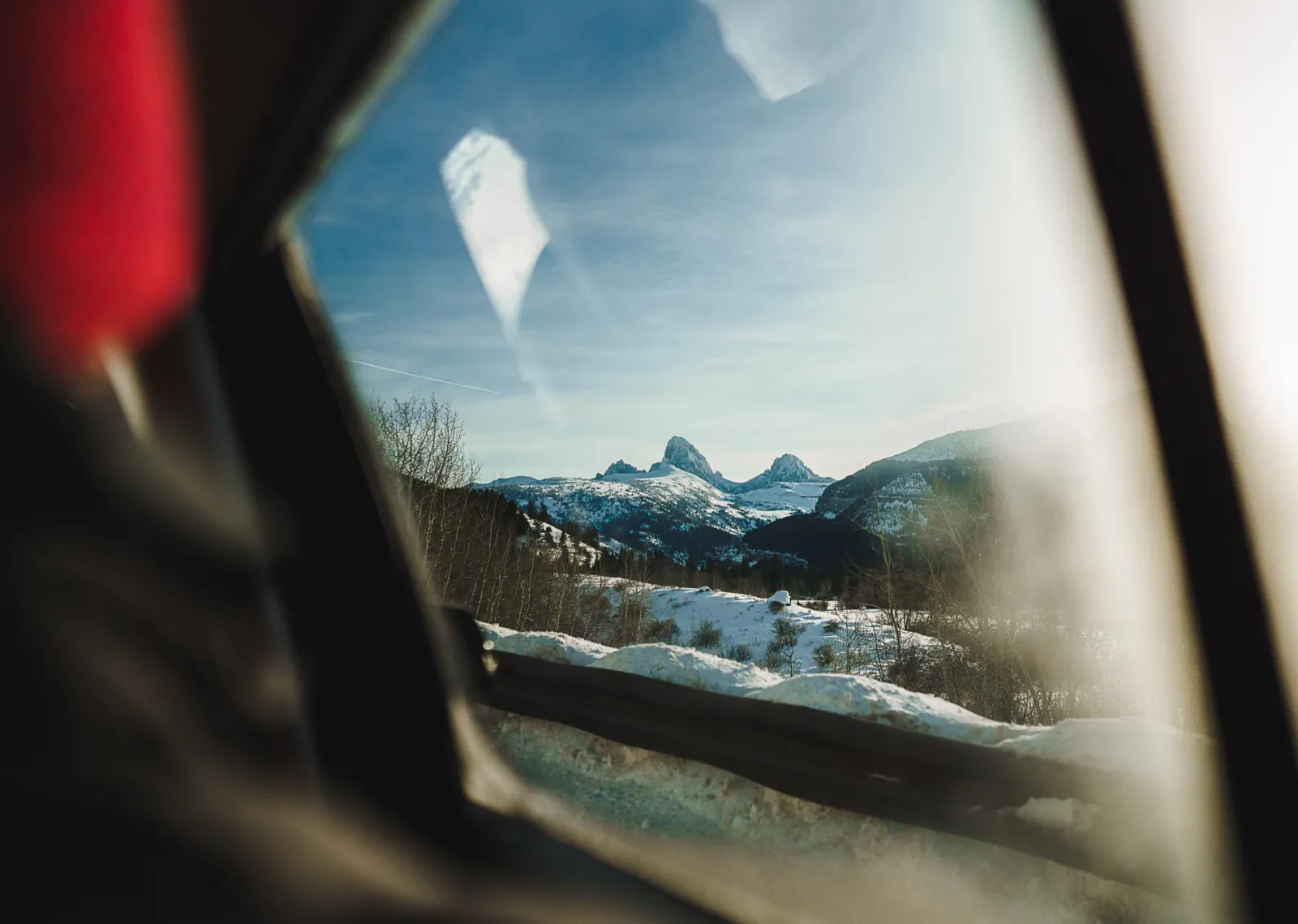
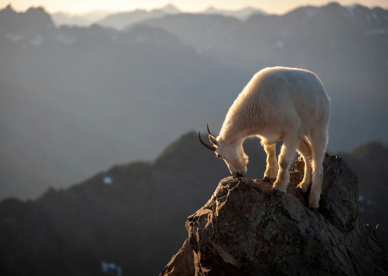
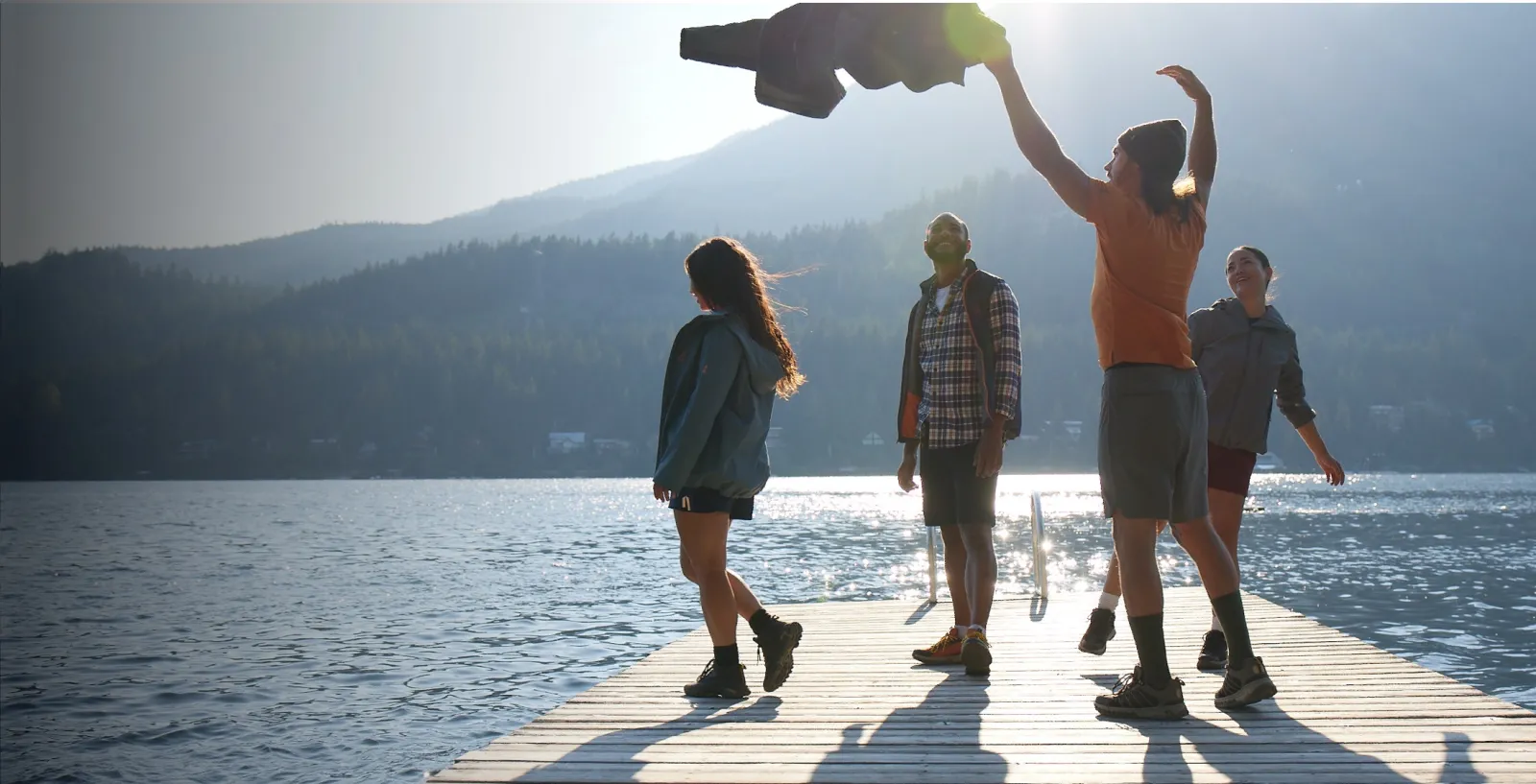
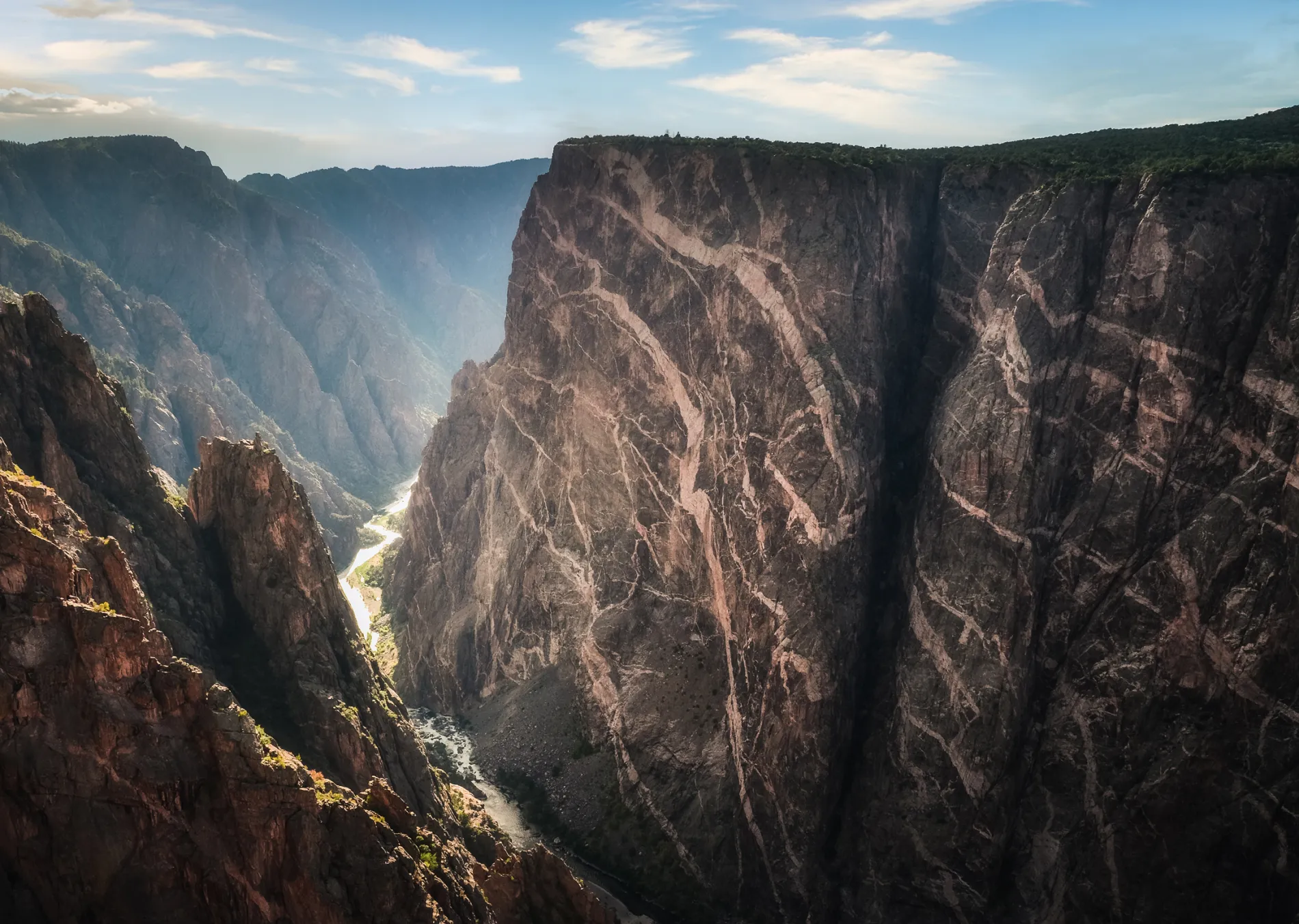
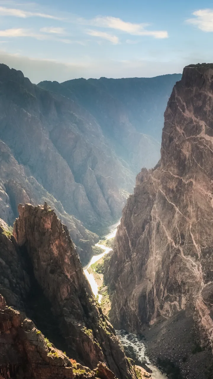
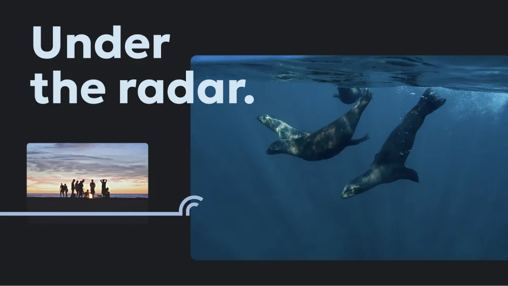
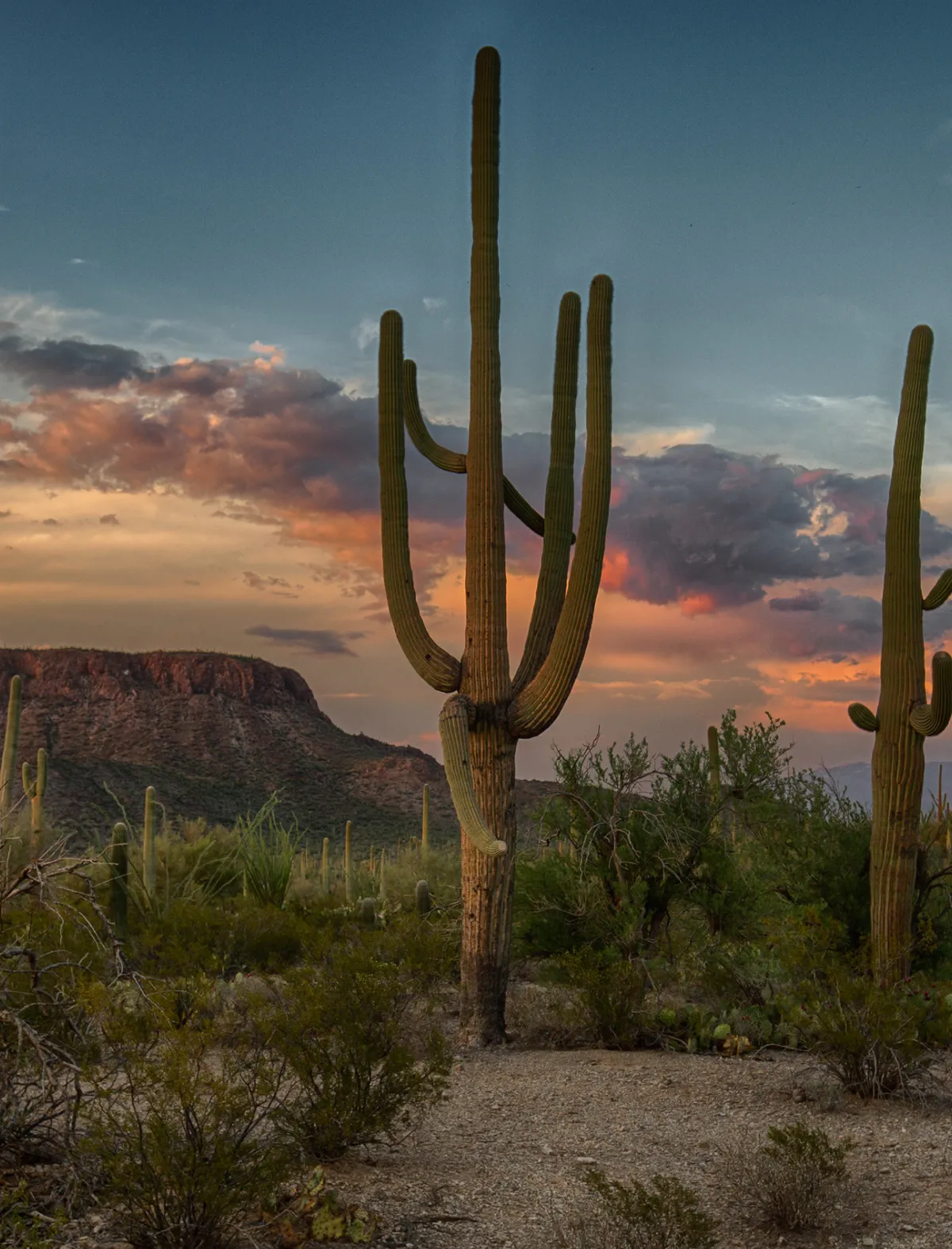
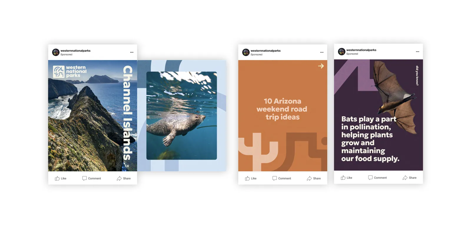
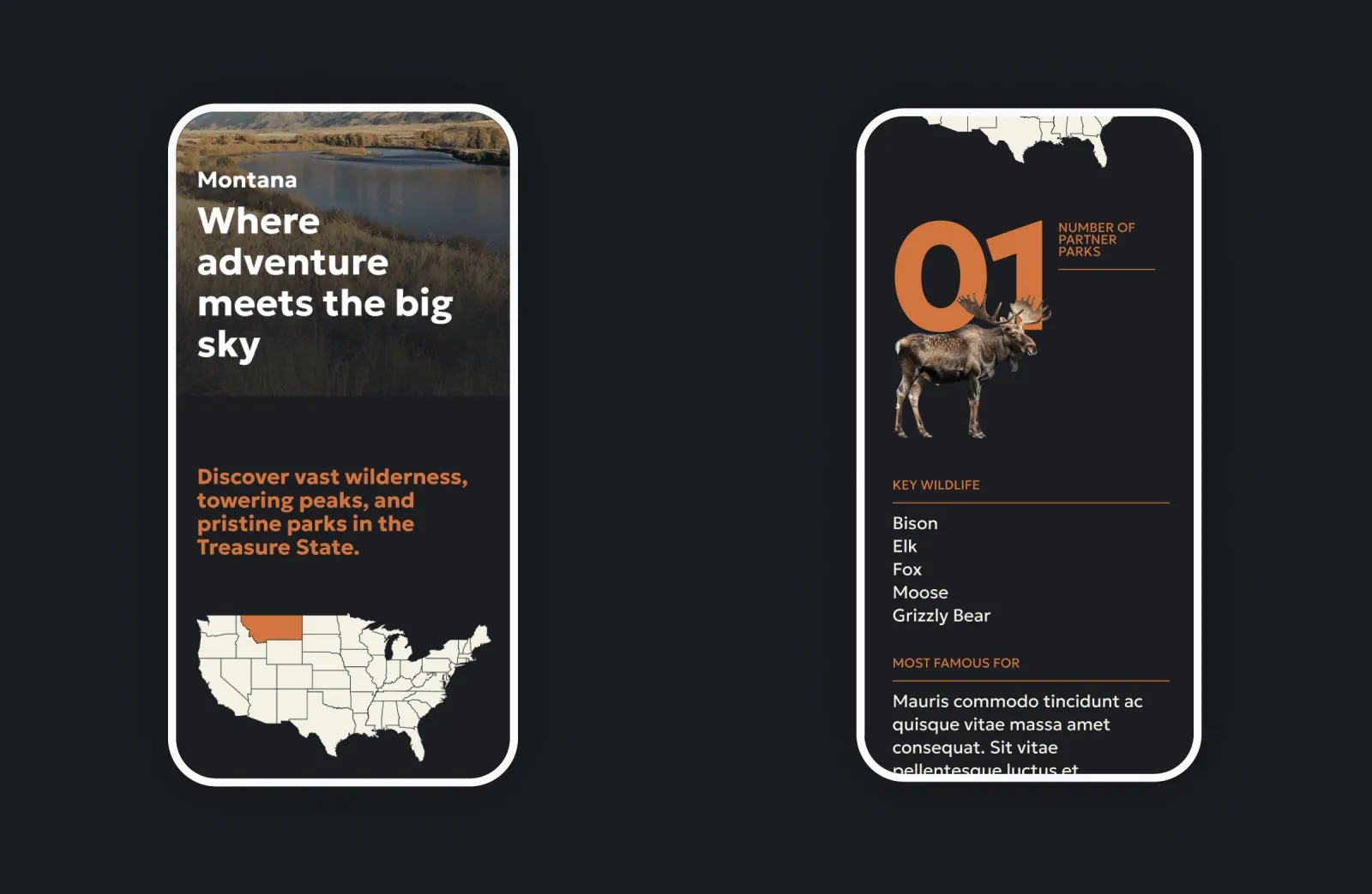
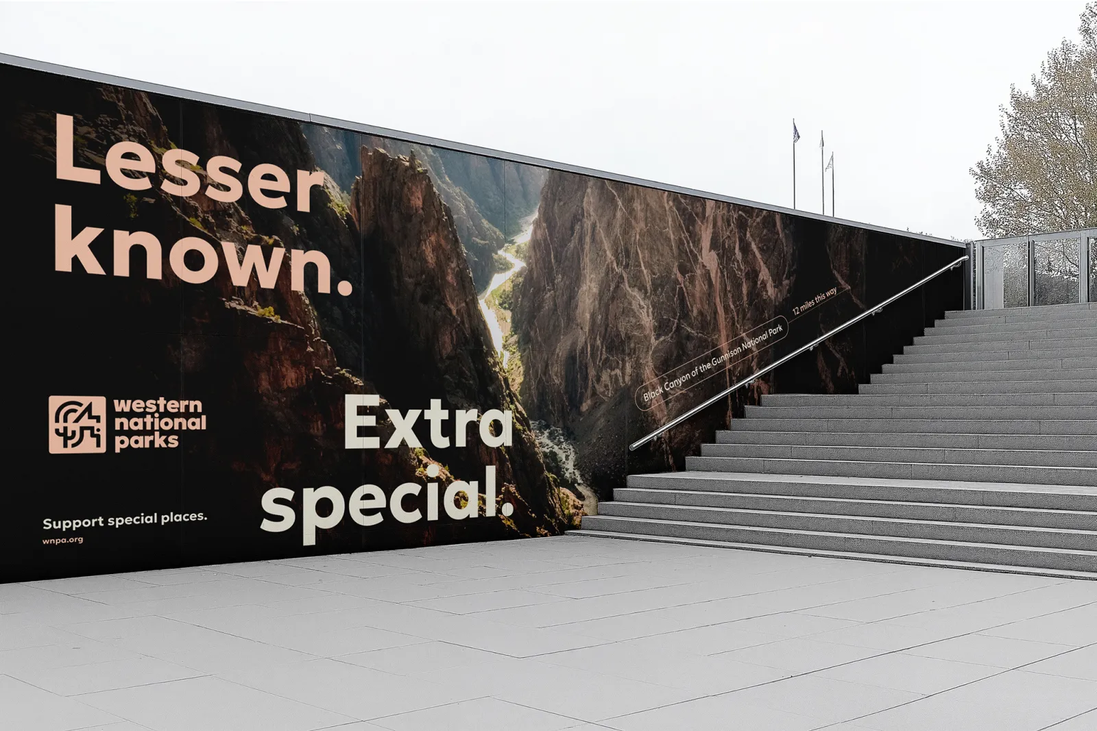
WNP’s graphic system draws from the diverse landscapes and cultures found within the national parks it supports. Custom iconography inspired by mountains, rivers, deserts, and historical monuments adds a distinct sense of place and purpose. These icons serve not just as design flourishes but as metaphors for the multifaceted park experience—education, exploration, preservation, and connection. On the website, they function as visual motifs that guide users through storytelling, calls to action, and navigation. Paired with a photography style that is both immersive and grounded—editorial, not staged—the result is a look that feels as human as it is majestic
A Modern Emblem with Historic Depth
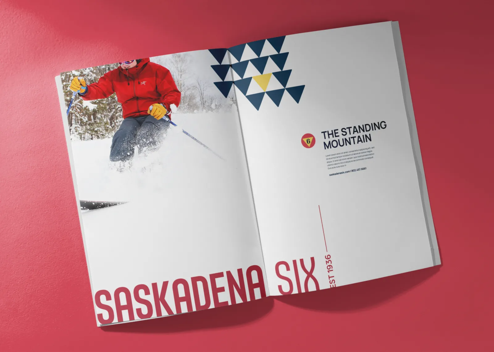
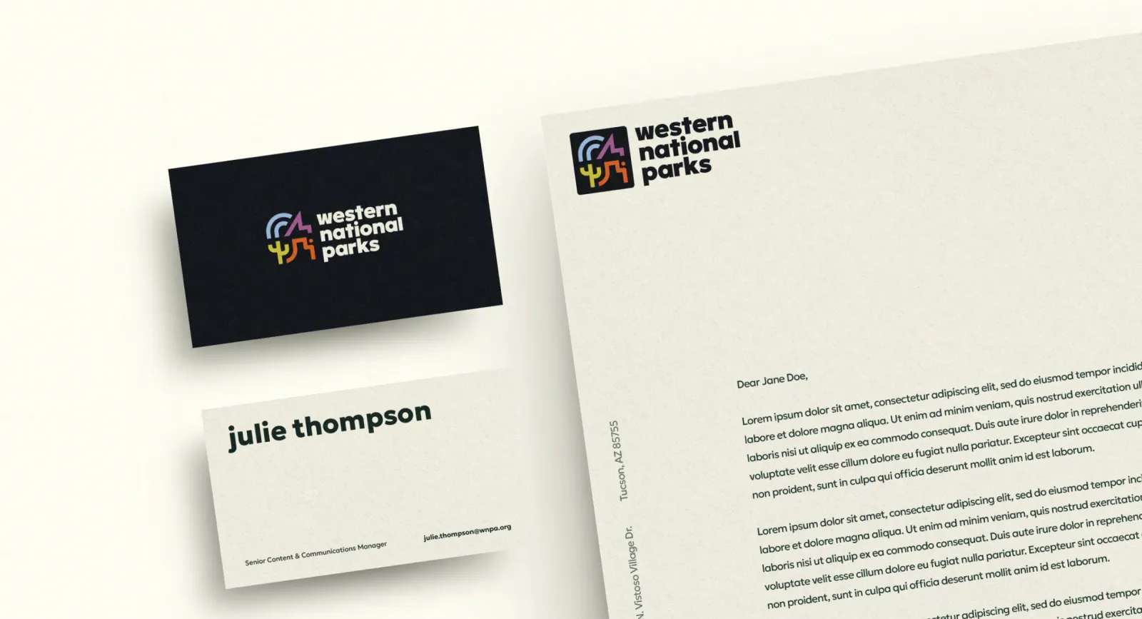
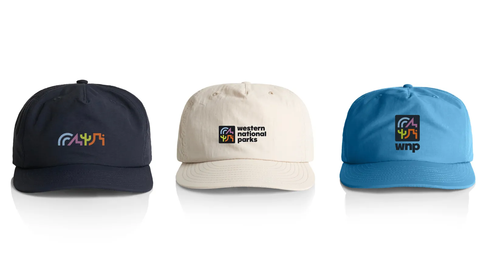
The WNP logo system strikes a delicate balance between contemporary appeal and legacy. The primary logo is a bold, color-rich mark that fuses abstract representations of land, water, and cultural heritage into a single cohesive visual. Its modularity allows for wide application—from digital screens to embroidered caps—while maintaining brand consistency. Secondary lockups and sub-brand logos, including TerraSync and The National Parks Store, each retain the visual DNA of the parent brand while allowing flexibility across programs. The logo’s geometry and structure convey strength, while its color treatments ensure warmth and approachability, a rare harmony in nonprofit and government-adjacent branding.
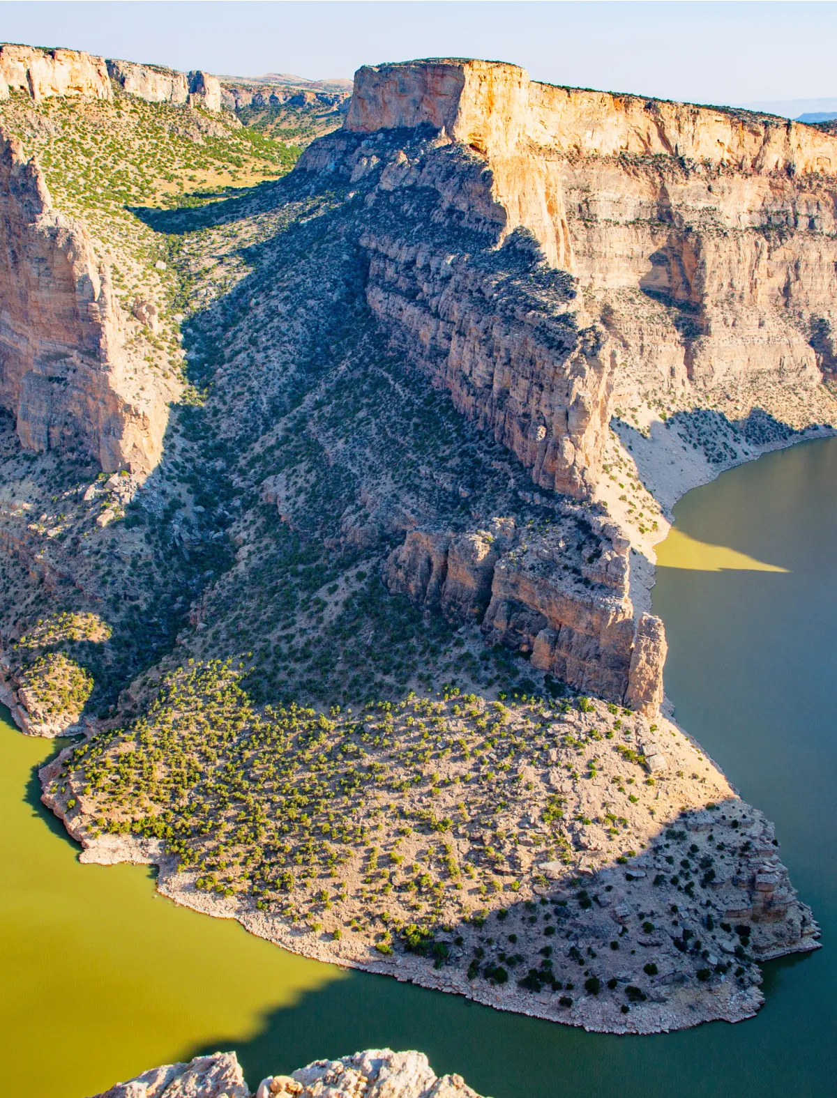

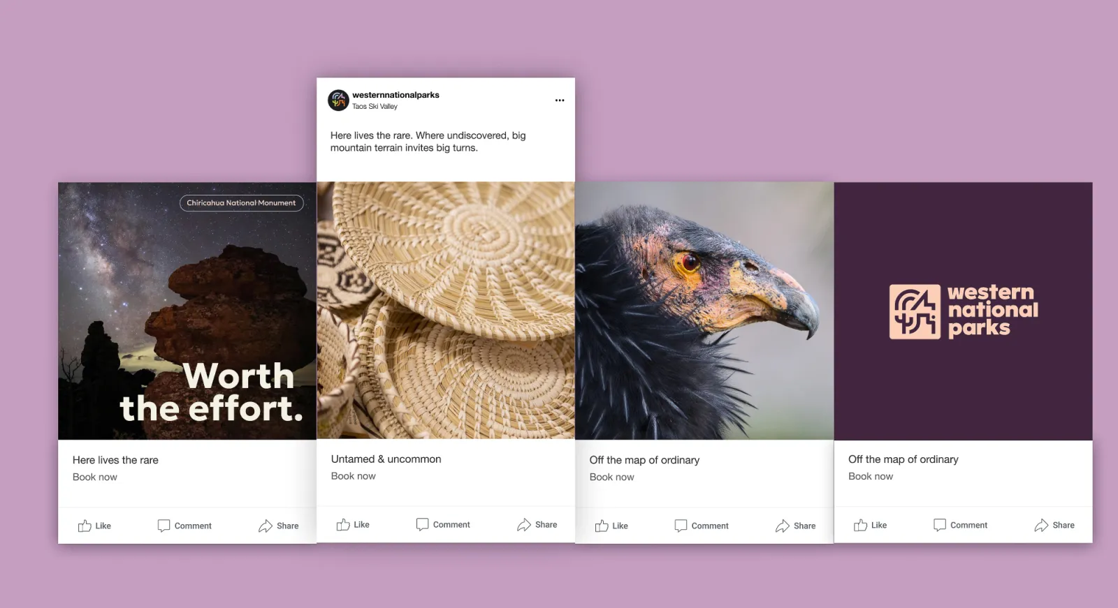
The photography style is both immersive and grounded, with an editorial quality that avoids anything overly staged. It’s a visual approach that feels as human as it is majestic, honouring both the awe of the parks and the authenticity of the people who experience them.
Color Palette: Natural, Expressive, and Balanced
WNP’s color system is rooted in the natural world but thoughtfully elevated for digital and print. Anchored by grounding tones like “Sandstone” and “Midnight,” the palette extends into expressive secondary colors such as “Yucca,” “Amethyst,” and “Ochre.” These colors evoke the landscapes of the American West without resorting to clichéd earth tones, instead embracing a modern, high-contrast aesthetic that brings freshness to the brand.
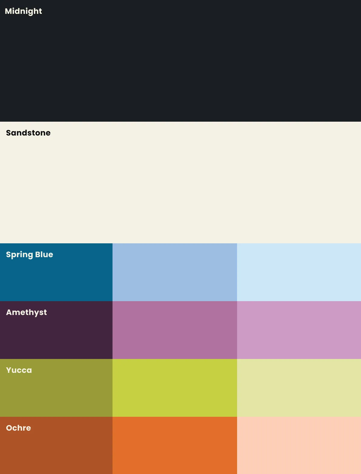
On the website, this palette plays a critical role in guiding user experience—distinguishing functional UI elements from storytelling blocks and creating a calming yet engaging visual rhythm. Used sparingly and intentionally, secondary hues provide emotional resonance while allowing the content to shine
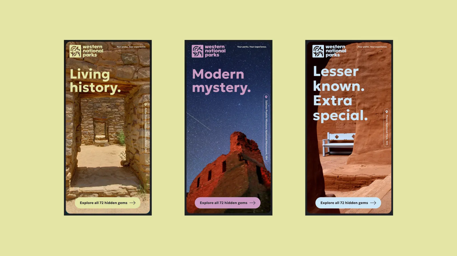
Huge thanks to the incredible team at Origin for helping bring the new Western National Parks brand to life. This was no ordinary assignment—72 unique park sites, from wild places to cultural landmarks. How do you design a logo for that? With heart, soul, and relentless creativity.
From emotional early meetings to research that blew the roof off, this collaboration delivered something special: a fresh brand identity, a powerful website, a bold campaign, and a renewed public presence—all to inspire park joy. We now have a platform that reflects our mission, connects travellers to parks and communities, and builds lifelong advocates.
Thank you for the passion, talent, and partnership. A client that hikes together, stays together.