

Data visualization: Making data beautiful
Collection and analysis of data is nothing new, but as new technologies emerge, the amount of data we produce is growing exponentially. Data can be used in many different ways; we can use it for good and for bad, to produce targeted advertising, plan strategic military activity or sculpt the world’s best athletes. With data visualization, we can even use it to explain complex problems in beautiful, interactive graphics.
“The world’s most valuable resource is no longer oil, but data”
Data visualization refers to representing data in a visual context to help people understand and disseminate meaning from that data. The human brain can process visuals 60,000 times faster than written text; by transforming complex data into charts, graphs and interactive visuals, we can explain complex trends in a more accessible format.
Data visualization can come to life in so many different forms and for so many different reasons
- To help make complex data easily understandable
- To tell a story
- To amplify data and its meaning
- To help build an experience
- To build beautiful visuals
With this in mind, here is a snippet of some of our favourite data visualizations that follow these trends.
Making the complex data understandable
Bus Bunching
We’ve all sat waiting for a bus at some point in our life, only to have two come at once. Now we have this interactive tool to help us understand the data behind the problem known as “bus bunching”. Trying to make sense of this data would have been very difficult but when it is represented visually, it becomes very easy to understand.
As the busses go around their loop, press pause and cause a slight delay, see what havoc you can cause.
Try the bus bunching data visualization here
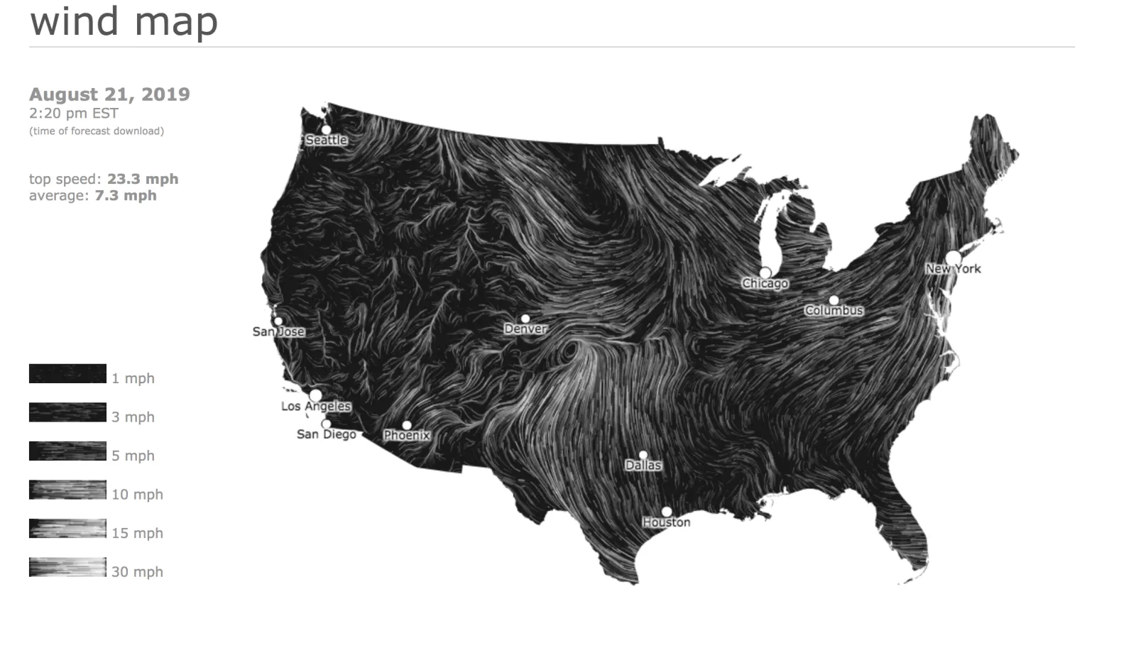
Wind Mapping
Wind mapping is an incredible visualization that shows current wind speeds in the U.S. The interactive map uses beautiful design to illustrate the direction and strength of wind in real time. Data that would be incomprehensible in its raw form is made captivating and understandable by data visualization.
Interact with a wind mapping visualization here
Storytelling
Google News Initiative is working with designers, artists and developers from all around the globe to visualize data and tell stories. These are two of our favourites from this project so far.
News Life Span
News life span is a collaboration between Google and Schema, telling the story of how news enters (and exits) public consciousness. Using 2018 search and trend data, Schema has been able to visualize the ways in which differing types of news stories enter public consciousness, how long they remain on the minds of the public and the speed at which these events slip from mind.
Visualize the news lift span here
Why Dogs & Cats
Why Dogs & Cats is a visual exploration by Nadieh Bremer in which she looks at the 4400 most asked questions about cats and dogs that start with the word “why”. The result is both hilarious and informative. Check it out and see what you can learn about our four-legged friends.
To create or amplify impact
The Depth of The Problem
Not all visualizations need to be interactive and harking back to the days of the infographic.ere is a great example of how visualization can really amplify an important message. This infographic shares how ocean vessels search the seafloor for airplane black boxes.
Bringing data you never knew could exist to life
CLEVER°FRANKE was invited to collaborate with fashion brand BYBORRE to create personalized data visualizations and a unique experience for guests of the Red Bull Playrooms. Guests invited to this Red Bull event were given a bracelet that tracked their movements and mood throughout the night; at the end of the night, each guest was given a print to take home that visualized where they had been in the club and how they had felt when they were there.
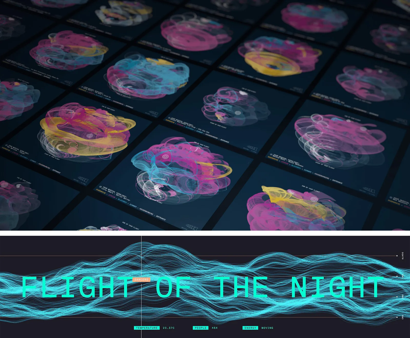
Sensor data gathered from guest’s bracelets was processed in real-time, generating the visualizations and projecting these on the main stage during the event.
To build a brand
Rapha
Our last example comes from luxury cycling brand Rapha in collaboration with a UK based agency, Accept & Proceed. To celebrate the signing of Peter Kennaugh to the Sky cycling team, Accept and Proceed visualized data collected from Kennaugh’s performance in all 21 stages of the Grand Tour.
The result is a beautiful brand with much deeper meaning.
Explore Accept * Proceed's visualized data for Rapha

That's all for now
Have you seen any visualizations we should know about or do you have some data that needs mining? Get in touch and let’s see where it could take us.