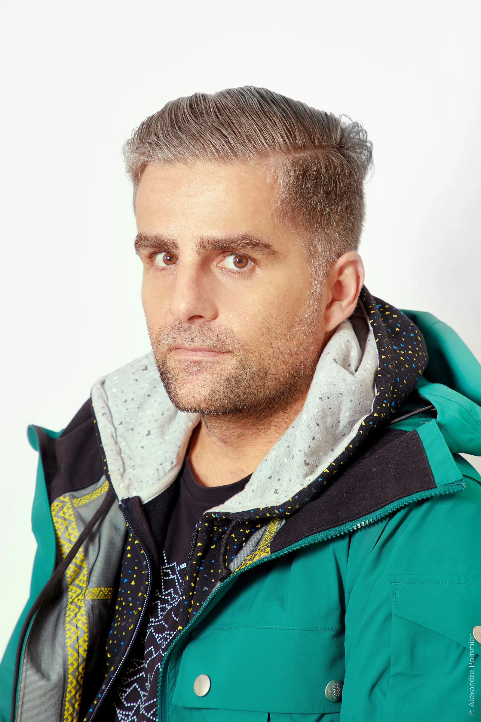
Talking shop with Yorgo Tloupas, the creative behind Black Crows Skis + more
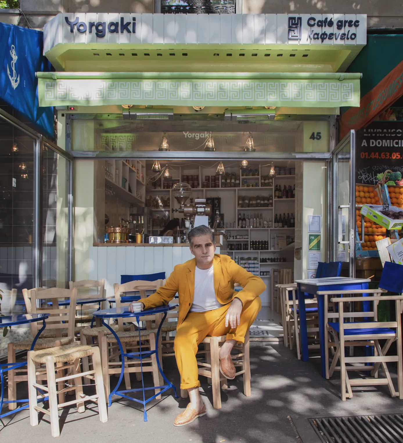
Yorgo Tloupas is calling me from his new Greek coffee shop in Paris, due to open the following day. Yorgo is no trained restaurateur though. He’s never waited a table in his life. He’s spent more time designing the logo than on getting building permits.
That’s Yorgo for you.
An obsession with aesthetic, paired with a fervent need to create and innovate.
For the past 20 years, Yorgo Tloupas has been the head of Yorgo & Co, a multi-disciplinary design studio in Paris, France. The studio is definitely not an ad agency. Yorgo is against using that term as, in his view, it has connotations of the bygone era of 1980s advertising agencies, which he has no interest in pretending to be a part of.
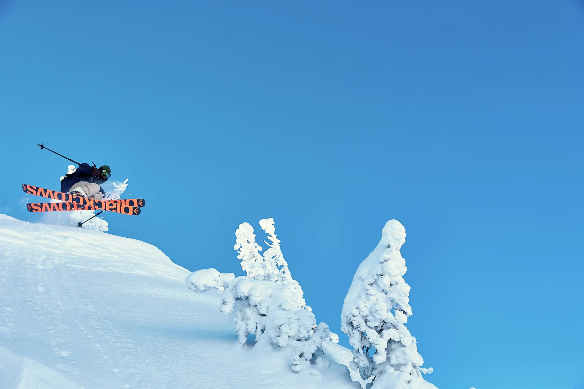
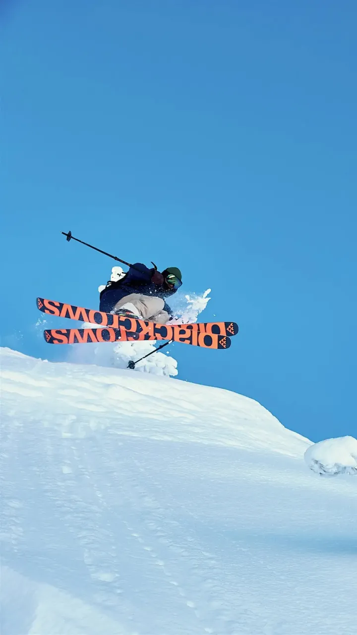
Yorgo’s prolific experience spans being the creative visionary for the black crows skis brand, art direction for premium fashion brands such as Cartier and Cognac, and being at the helm of Vanity Fair France. Throughout, Yorgo’s passion for where the outdoors and fashion intercede has positioned him as a creative maven within the traditionally coarse and unrefined world of ski branding.
I caught up with Yorgo to learn more on what makes this Parisian creative tick.
Origin: Most of our readers are North American based. Tell us a bit about the branding and marketing scene in France.
Yorgo: I’m lucky and unlucky at the same time to live in a country where branding is somewhat undeveloped. French understanding of graphic design and branding is kind of weak, I find. CEO’s don’t quite grasp why it’s so important to have a good logo so I get plenty of work in that department which is great. But sometimes I get a bit worried about it and feel like I might be in the wrong country, but like I say it just means there’s plenty of work for me to do.
Origin: That’s funny you say that since Paris is seen as the capital of luxury brands. Is the reason you mostly work on premium brands a product of your environment or is it more a conscious decision?
Yorgo: It’s just a natural phenomenon since most of the people I meet tend to be from these luxury brands. In fact, sometimes I dream of doing mass-market branding for something like Target or a national railway company. Blue-collar stuff.
Paradoxically, a lot of the big agencies dream of working on luxury brands and I work on all the luxury brands and dream of working on the mass market trucking style brands. Things that are honest. I guess the grass is always greener.
Origin: What’s it like working for premium brands like that?
Yorgo: It’s funny, right now my biggest client is Cartier, the jewellery brand, and I basically end up becoming a kind of historian of a brand like that. I’m there to keep the value of the brand high by making the brand historical.
Origin: Branding rooted in heritage. It’s timeless, in a way. Speaking of timeless, are you still doing a lot of art direction for magazines?
Yorgo: I’m still doing art direction for Vanity Fair France. I launched the French edition in 2013 and have been doing it since. It’s great, Vanity Fair has always been one of my favourite magazine’s so it’s super interesting to be at the helm of the French division. For the past year or so we’ve been allowed a bit more creative freedom too so it’s really starting to take on a life of its own.
Origin: Yet everyone says “print is dead”.
Yorgo: I’ve been doing magazines for 20 years now and people are always saying that. But it never seems to happen. I’m still here. But I can start to feel the budget begin to shrink of these magazines so that part is true.
Origin: It’s become more so a tool for creative expression as opposed to a utilitarian method to communicate information, I find.
Yorgo: It’s a way of expressing yourself and expressing ideas, for sure. In a way, print has become a luxury product. If you print something it means you have the means to do it. It’s very easy to put something on Instagram, but it’s harder to put 120 pages together, bind them, and ship them. It’s a very different commitment. An expensive one, but a very pleasant one.
"In a way, print has become a luxury product. If you print something it means you have the means to do it. It’s very easy to put something on Instagram, but it’s harder to put 120 pages together, bind them, and ship them. It’s a very different commitment. An expensive one, but a very pleasant one."
Origin: What part of design gets you the most excited?
Yorgo: Logo design, for sure. It’s the ultimate expression of my craft. It’s one of the oldest methods of expression in civilization. Before there were words, there were symbols. Logos were used to communicate intention. The fact logo design is such an ancient art form is incredibly fascinating to me. Logo design keeps me up at night. I’m currently writing a book about it. Not about my logo designs professionally, but where the notion of a logo originates from.
"It’s my mission to make people more aware of logos. To understand the importance of logos. There’s constantly logos around us and we’re perpetually wearing them. But nobody really knows about them or talks about them like they do about say art or cinema. Yet, people are exposed so much more often to logos."
Origin: It’s much more of a passive art form.
Yorgo: It’s there always, exactly. I’m really interested in that. It’s truly my passion.
Origin: You’re involved in a lot of very different yet similar industries. What’s your take on where ski design specifically is headed?
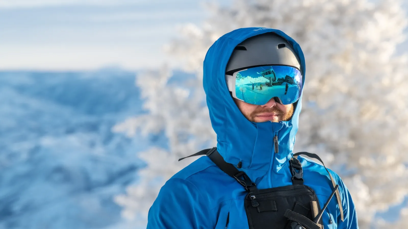
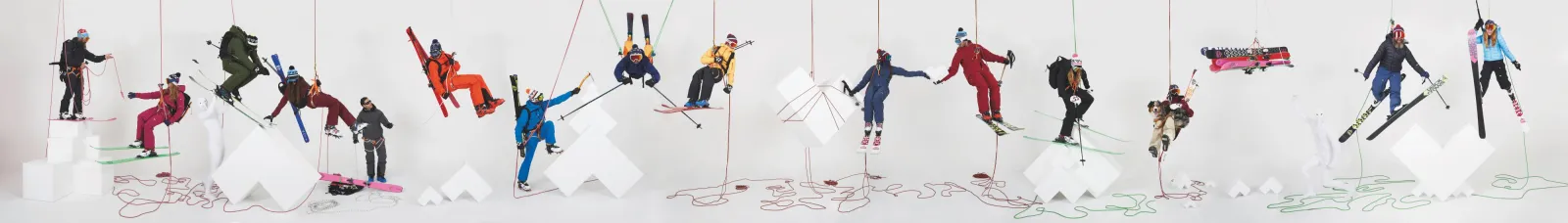
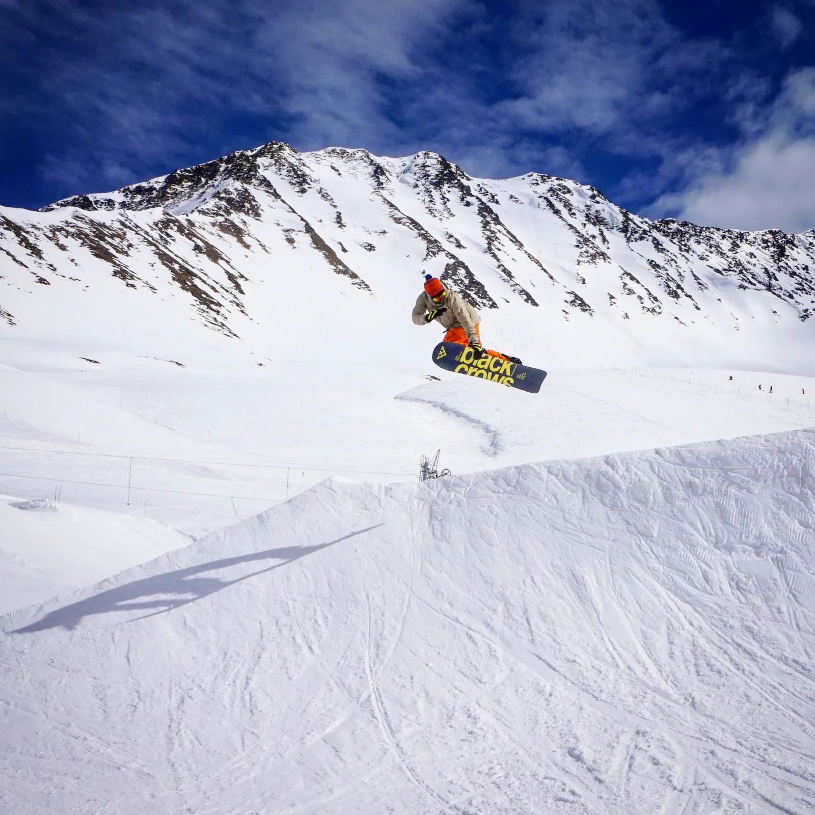
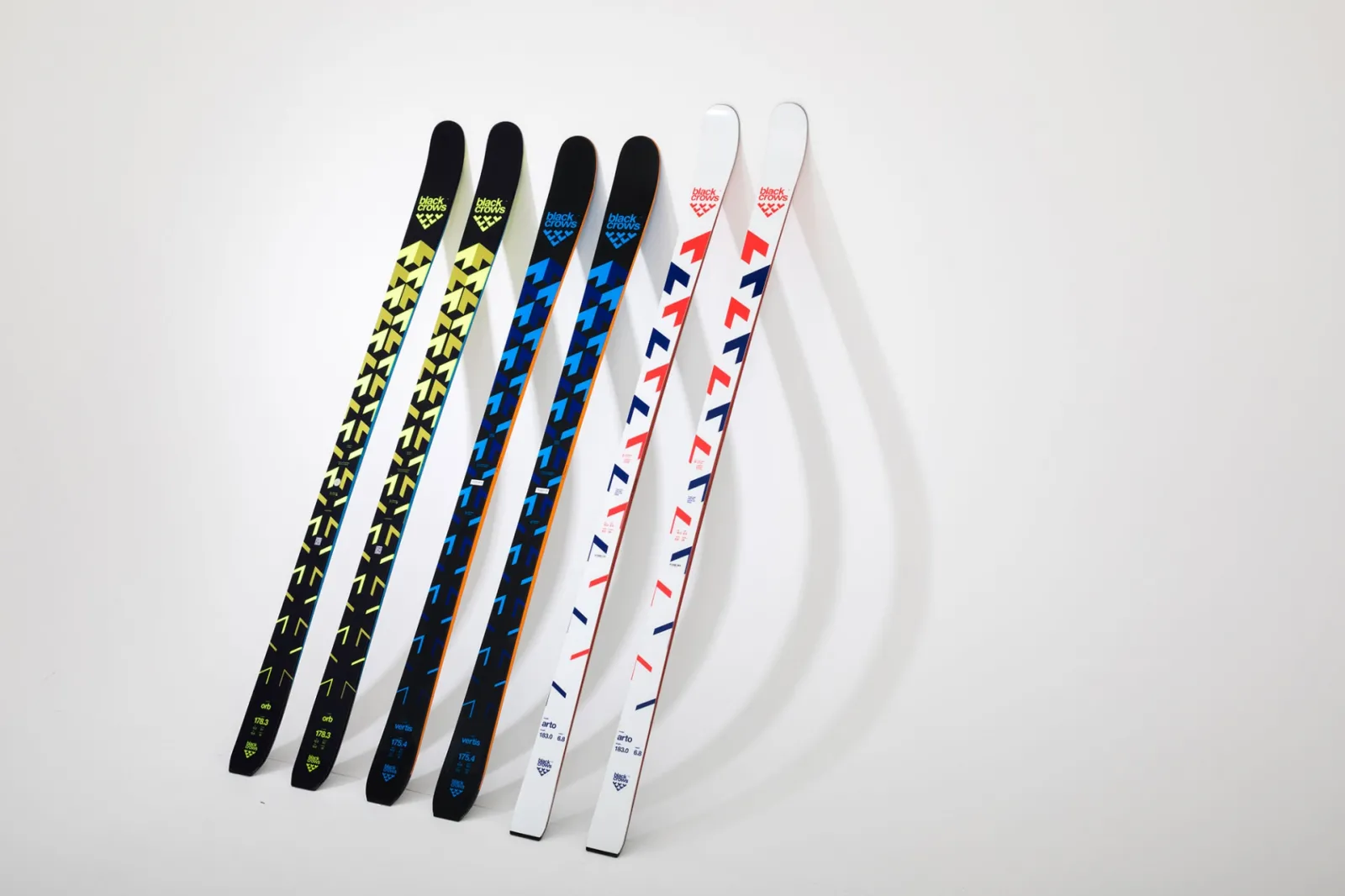
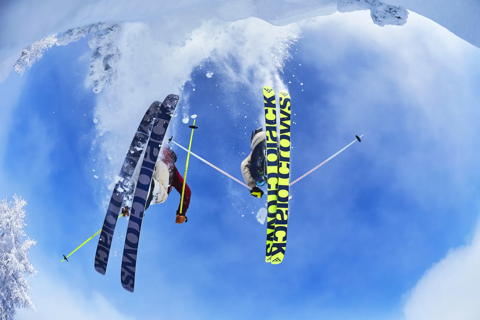
Yorgo: Well it’s interesting because every year I go to all the trade shows. And you know I don’t want to take full credit but what we (black crows) used to do was quite rare, and it’s much more of a common “look” now. When we started (2007), it was either sporty race bike looking skis, or pseudo skateboard graphics with girls and graffiti. Nothing in between. But being a skateboarder there was no way I was going to pretend to make skis rooted in skateboarding culture. I could never do that. So that left us with following this more crisp and military look with black crows.
I’m also seeing more cross-pollination across different industries. The fashion world is taking note of the ski world, and vice-versa. Things are becoming more fluid and I think you’re seeing that in the ski industry.But design in skis is inherently very tricky. It’s as if you’re designing on chopsticks. I’m basically a chopsticks designer.
Origin: Chopstick designer?
Yorgo: Well it’s such a difficult surface to use as opposed to other canvases like a magazine, which are square. I’m designing on a stick. So it’s hard to predict where trends are headed. It’s quite limited in some ways what you can do with ski design, yet because it’s such an unusual format there are also so many unique ways I think that can still be explored. But the materials used to make skis limit what you can actually create on them.
You need to circumnavigate these constraints while still creating something innovative. But that’s when the best creative comes out. Just look at car designers. They have so many constraints around their canvas yet come out with the most amazing work.
Origin: I find it’s when you’re inundated with constraints that some of the most innovative and creative work arises.
Yorgo: Exactly. And you know I find myself lucky to be at the inception of a brand like black crows. Being there from day one means I’ve had creative control since the beginning. It’s very close to me. Being at the start of a brand is just exceptional, on so many levels.
Origin: It’s truly special, isn’t it. Thanks for chatting Yorgo, I hope I can try your Greek coffee sometime soon!